Your cart
Close Alternative Icon

Posts

Spring 2018 Pantone Colors Chart

Spring 2018 Pantone Colors Chart

Spring 2018 Pantone Report Color Chart by Erika Firm Wow! The 2018 Spring Colors that Pantone picked for its Spring fashion trends report are lovely, aren't they? Naturally, Arcadia (hello, any shade of green!!!) is my fave ... but I'm also loving Blooming Dahlia, Almost Mauve, and Chili Oil. And surprise ... I mean, this is SO unlike me ... I also really am loving one of the purples: Pink Lavender. Based on what I'm seeing trending out in the fashion and home décor world, I'm predicting Blooming Dahlia, Pink Lavender, or Chili Oil as the 2018 Color of the Year. I'm seeing tons of Blooming Dahlia and Chili Oil and Almost Mauve in clothing stores, and loads and loads of Pink Lavender, Spring Mauve and Ultra Violet (as well as Chili Oil) in interior design magazines. But we'll just have to wait and see.


Spring 2018 Pantone Color Combinations by Erika Firm

Blooming Dahlia (Pantone 15-1520) goes with everything! I already own a few pieces in this color for my fall wardrobe, but I'm on the hunt for a pretty Chili Oil sweater. I think it will look great with jeans and an olive coat. My favorite combination is Blooming Dahlia-Chili Oil-Almost Mauve. Stunning, right? I'm also loving Arcadia-Emperador-Spring Crocus together. A little bold for my closet, but it could be fun for a spring dinner party tablescape.

Spring Color Combinations inspired by Pantone 2018 Colors by Erika Firm

Some of my favorite 2-color combos using the Pantone Spring 2018 colors are unexpected color combos like Emperador and Lime Punch; Arcadia and Blooming Dahlia; and Chili Oil and Blooming Dahlia. Emperador and Chili Oil are really growing on me. Rich chocolate browns with a hint of rust or red are pretty hot. Like an Aztec hot chocolate. Do you think brown circa 2005 is ready for a comeback? It really does go with everything. Maybe it's the new grey?


Spring 2018 Pantone Report Color Chart by Erika Firm
Spring 2018 Pantone Color Combinations by Erika Firm
Spring Color Combinations inspired by Pantone 2018 Colors by Erika Firm
Continue reading

Rendered Nest Branding

Rendered Nest Branding
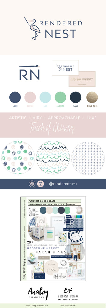
Rendered Nest Kids Bedding branding by Erika Firm Celebrate the YAY! Congrats to Andrea of Rendered Nest on her new brand. Rendered Nest is a darling line of baby accessories and nursery décor with an artistic flair. Whether using exclusive fabrics designed by artists or giving back through philanthropic support of art education in our communities, Rendered Nest believes that art should be celebrated by all. Keep an eye out for her next collection -- it's going to be lovely. Continue reading

Le Petit Garage Branding

Le Petit Garage Branding
Le Petit Garage Boutique Logo and Branding by Erika Firm Analog Creative Co. New brand launch. Woot! Congrats to Cara of LE PETIT GARAGE on her new look. Le Petit Garage is a retail women's clothing and accessories boutique on the Jersey Shore. It's a fun neighborhood spot, and is a must visit store for locals and tourists alike. To create the Le Petit Garage logo and brand we took inspiration from Cara's love of labs, her decidedly preppy vibe, and her penchant for bright (bust out the sunglasses) color. Cara is always updating her sweet online shop, so even if you can't make it to Seaside Heights you can still shop her fun collection online: www.LEPETITGARAGE.com. Continue reading

Fall 2017 Pantone Colors Chart

Fall 2017 Pantone Colors Chart
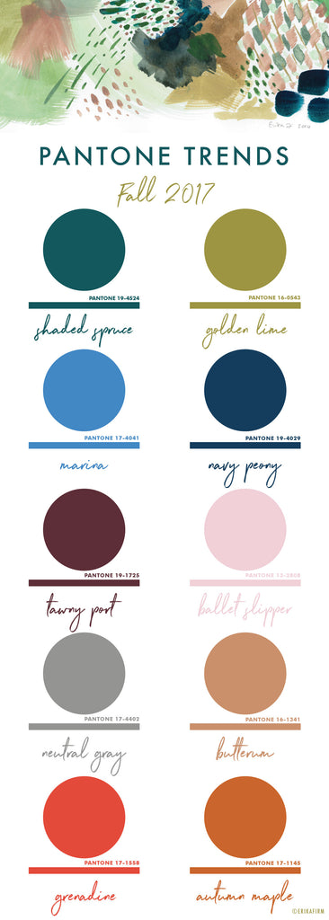
Pantone Fall 2017 Color Trends Report Erika Firm Color Trends 2017 Color Palettes by Erika Firm Pantone is on a roll this year. I love the 2017 Fall Colors that Pantone picked for its Fall fashion trends report. Naturally, Golden Lime (hello, green!!!) is my fave ... but I just love them all. Even Autumn Maple, which could be a seventies cognac, is growing on me. I had fun pairing my favorite 2017 Spring and 2017 Fall colors together, along with the Pantone Color of the Year, Greenery, to create some trendy color palettes for 2017. Continue reading

Stella Chroma Branding

Stella Chroma Branding
Stella Chroma Logo Design and nail polish branding by Erika Firm for Analog Creative Co
New brand launch. Woot! Congrats to STELLA CHROMA on their new look. I had a blast designing this project. My favorite parts were coming up with their new name (formerly Paint Box Polish), and painting the dreamy backgrounds. Can't wait to get my hands on some of their new nail polish. Continue reading

Greenery 2017 Pantone Color of the Year

Greenery 2017 Pantone Color of the Year
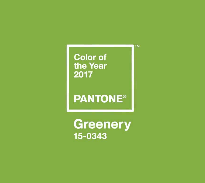
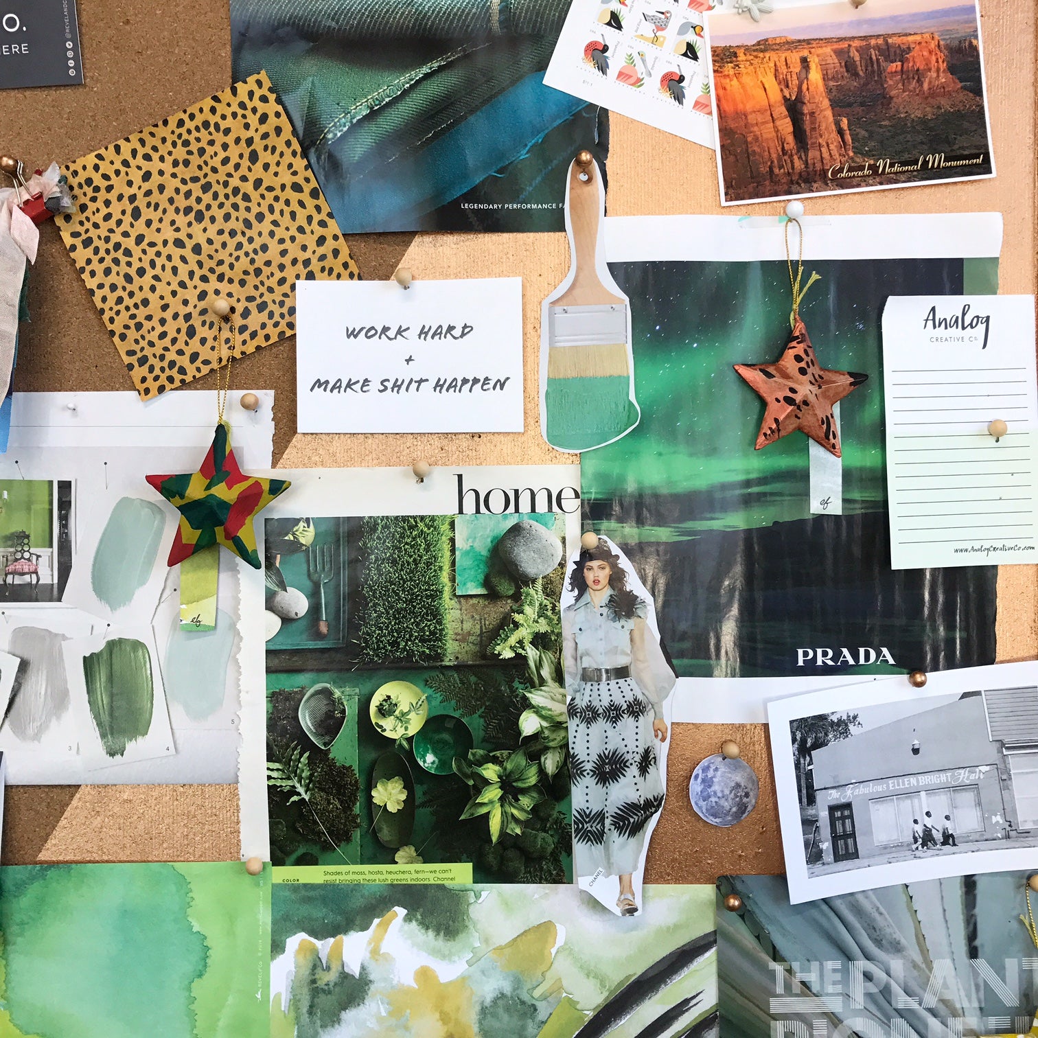
Pantone Color of the Year 2017 Greenery 2017 Pantone Greenery Color of the Year 2017 Color Combinations by Erika Firm green-bulletin-board-erikafirm-square green-holiday-ornament-erika-firm hand-painted-ornaments Revel & Co. 2016 green-bulletin-board-erika-firmOMG. GREEN!!!! Y'all know it's my forever favorite color. I think Pantone nailed it with the color of the year for 2017: Greenery. I especially love Greenery paired with Pantone's other 2017 color picks: Kale (naturally), hazelnut, and pale dogwood. Happy dance over here at my studio! Continue reading
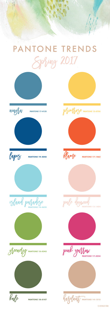
Spring 2017 Pantone Colors Chart

Spring 2017 Pantone Colors Chart
Pantone Spring 2017 Color Trends Report Erika Firm All the heart eyes for the 2017 Spring Colors that Pantone picked for its Spring fashion trends report. Naturally, Kale (hello, green!!!) is my fave ... but I just love how Pale Dogwood plays as the perfect neutral. Pantone Pale Dogwood neutral color palettes Pale Dogwood (Pantone 13-1404) goes with everything! My favorite combination is pale dogwood-hazelnut-kale. Stunning. Continue reading

Emerald Green Abstract

Emerald Green Abstract
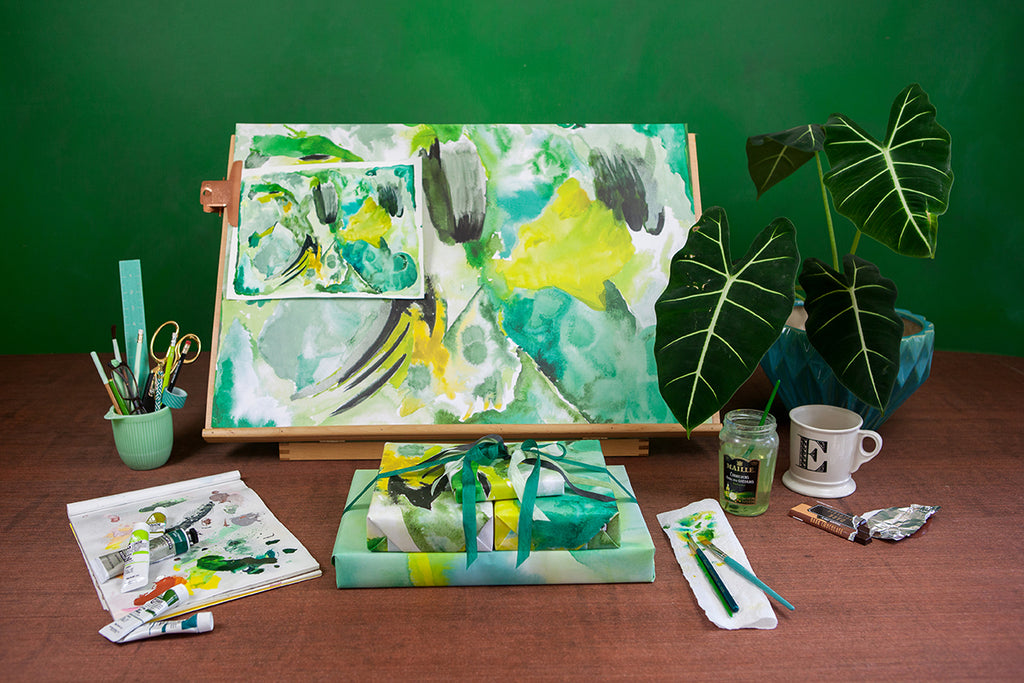
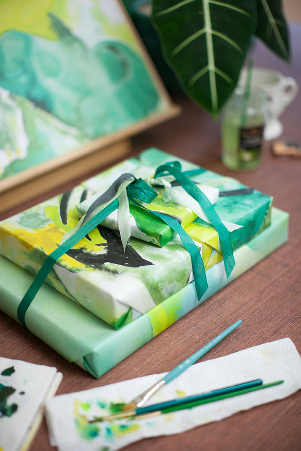
Revel & Co. 2016 Green-abstract-surface-design-54 Green-abstract-surface-design-60 Green-abstract-surface-design-69 "Johns Island Sunday" was inspired by the salt marshes after the rain. Green-abstract-surface-design-71"Mossy North Side" was inspired by Johns Island woods after a series of storms. All the crazy mosses, lichens and fungi were popping up in our yard. Revel & Co. 2016 "Wind Break" was inspired by a particularly windy and rainy day. This is my interpretation of my backyard pond. Revel & Co. 2016 One guess what my favorite color is!!! emerald green abstract paintings When I painted this series of green abstracts it was raining buckets and all of Johns Island was emerald and rainforesty. In other words: heavenly. I'm honored that Revel & Co. chose to blow up my paintings and put them on wrapping paper. I don't have the space in my home studio to do large format paintings, but seeing my work on big sheets makes me want to move into a bigger space and bust out some giant canvases. PHOTOS | ZoomWorks Photography for Revel & Co. Continue reading