Your cart
Close Alternative Icon

Posts

Abercrombie Jewelry Brand Identity

Abercrombie Jewelry Brand Identity

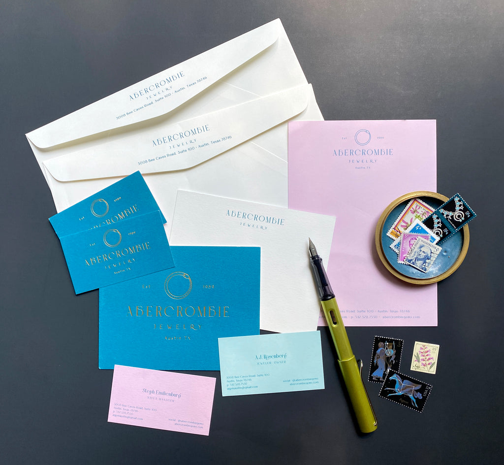
I was thrilled to design a re-brand for Abercrombie Jewelry, a family jeweler based in Austin, Texas. I had originally designed their logo more than 10 years ago and it was time for a refresh. 

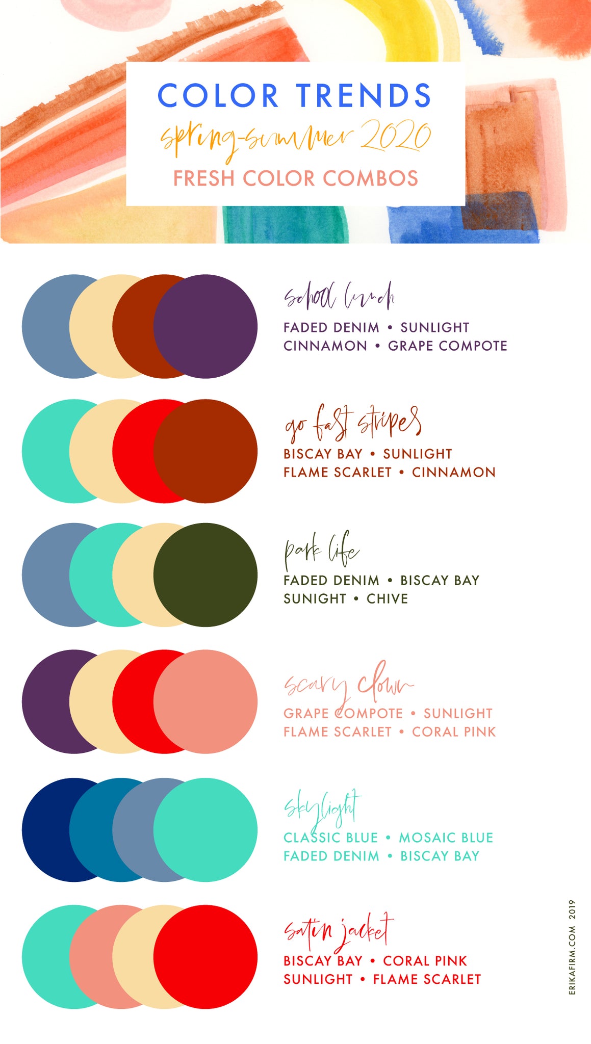
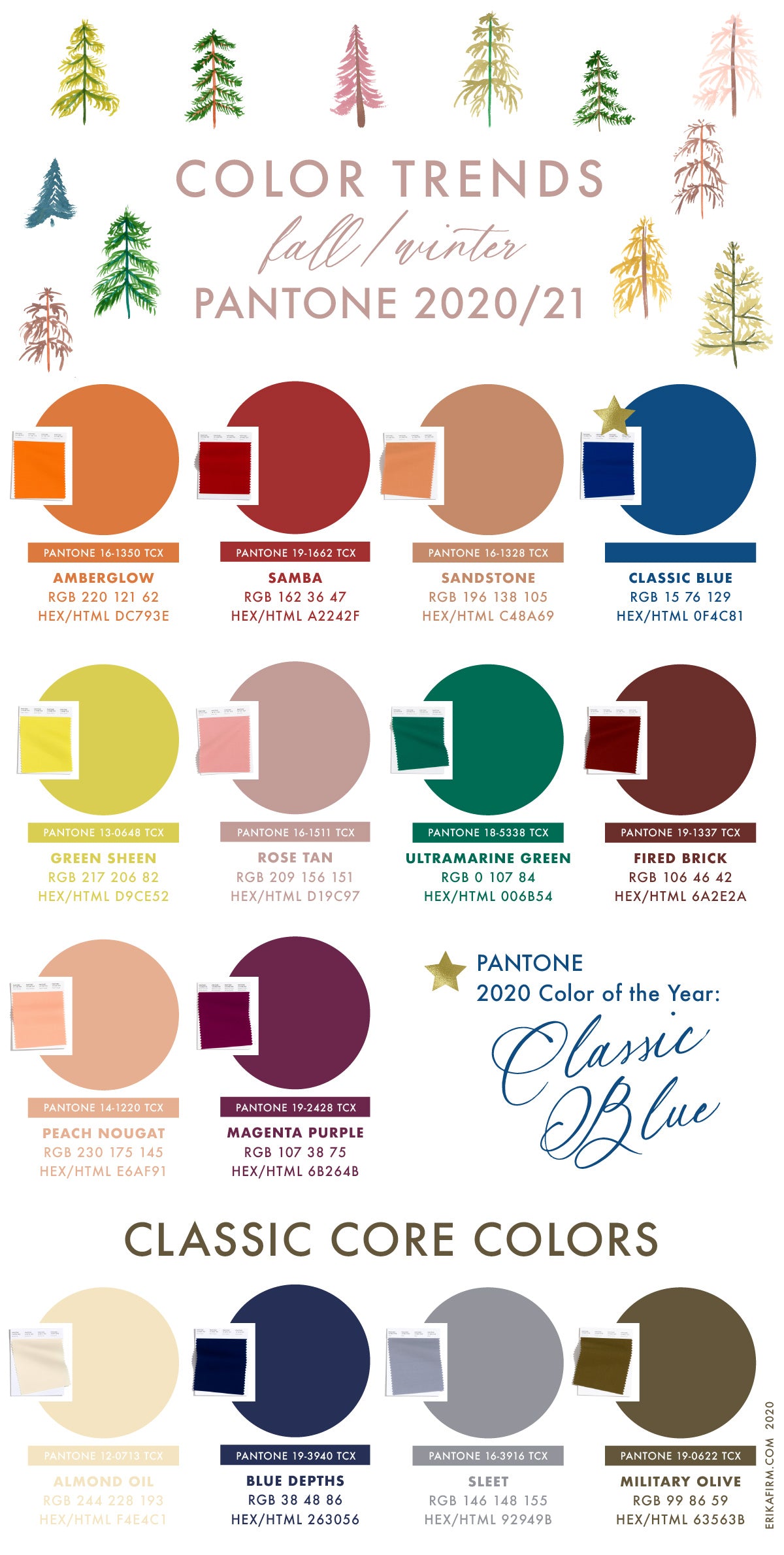
I started with a mood board (you can see it here) and an updated color palette, focusing on luxe yet unusual colors. 

Abercrombie Jewelry Logo and Branding by Erika Firm

Abercrombie Jewelry Logo and Branding by Erika Firm

Abercrombie Jewelry Brand Identity by Erika Firm

Abercrombie Jewelry Logo and Branding by Erika Firm

Abercrombie Jewelry Logo and Branding by Erika Firm

Abercrombie Jewelry Logo and Branding by Erika FirmAbercrombie Jewelry Logo and Branding by Erika Firm

Continue reading

Color Palette: Isn't She Unusual

Mood Board Isn't She Unusual by Erika Firm featuring David Bowie
Color Palette Isn't She Unusual by Erika Firm featuring Dark Arrondissement Blue, Lagoon blue, third eye blue, white lilac, moon glow grey, and pistachio green
The Isn't She Unusual mood board and color palette was inspired by magical vibes: David Bowie songs, raw gemstones, Parisian passageways, velvet ropes, and secret speakeasies.
The color palette features Dark Arrondissement Blue (Pantone 2025c), Lagoon Blue (Pantone 308c), Third Eye Blue (Pantone 552c), White Lilac (Pantone 263c) , Moon Glow Grey (Pantone 5313c), and Pistachio Gelato Green (622c).
Continue reading

Mood: Don't Call it Blurple

Color Palette Mood Board Don't Call it Blurple by Erika Firm featuring Indigo Laptop Bag by Alesya Bags


I love how edgy indigo looks when paired with peony pink, caviar black, crisp white, and delphinium blue. This is a powerful color palette for sure — even with pink and light blue hues in the mix.

When my friend Alesya was designing her latest collection of leather laptop bags that don't look like laptop bags, the stand out color was a purplish-blue hue that we temporarily dubbed "don't call it blurple." She settled on "Indigo" as the final color name for two reasons. Number one: technically, indigo is the color between blue and violet on the visible spectrum — which the bag most certainly is. Number two: indigo is the name of a dye of the same color extracted from the Indigofera plant, a crop important to early South Carolina history

I always love the colors Alesya brings to the table. Fingers crossed for a green in the next collection. Just sayin'. 

Continue reading

Fall 2020 Winter 2021 Pantone Colors Trends

Fall 2020 Winter 2021 Pantone Colors Trends
Pantone Fall 2020 Winter 2021 Color Trends by Erika Firm

The Fall 2020 / Winter 2021 Colors that Pantone picked for its Fall 2020 / Winter 2021 fashion trends report are gorgeous. Not much of a surprise to y'all who know me at all: Ultramarine Green, Green Sheen and Military Olive (hello, any shade of green!!!) are my favorites. I'm also loving Peach Nougat, Sandstone, and Rose Tan. The palette is full of warm, richly pigmented earthy colors. Although this is the Fall/Winter palette, I think most of these colors work year round.

Pantone Fall 2020 Winter 2021 Color Combinations by Erika Firm
Pantone Fall 2020 Winter 2021 Color Pairs by Erika Firm

When you see the entire palette all together it seems a little … much. But take nearly any two or three and they play nicely together. For holiday 2021 color palette I'm feeling Samba, Rose Tan, and Ultramarine Green together … would look great with a pop of gold foil.

The current trend for weddings seems to be slowly pulling away from blush and peach, into richer reds like samba and fired brick. But I'm predicting 2021 and 2022 weddings will see a turn toward blue, including Pantone's 2020 color of the year: Classic Blue, paired with darker Blue Depths, Sleet, Military Olive, and Almond Oil.

Want more color and trend spotting? + Read my take on Pantone's Spring/Summer 2020 collection here + Check out my Pinterest board full of Color Inspiration + Check out my Pinterest board full of the latest trends.

Continue reading

Spring Summer 2020 Pantone Colors Trends

Spring Summer 2020 Pantone Colors Trends

Pantone Spring Summer 2020 Color Trends report

Wow! The 2020 Spring Colors that Pantone picked for its Spring - Summer 2020 fashion trends report are lovely, aren't they? Surprise ... Chive (hello, any shade of green!!!) is my fave ... but I'm also loving Coral Pink, Saffron, and Cinnamon. Based on what I'm seeing trending out in the fashion and home décor world, I'm predicting Coral Pink, Saffron, or Sunlight as the 2020 Color of the Year. But we'll just have to wait and see.

Pantone Spring 2020 Pantone Summer 2020 Color combos with five colors

Sunlight (Pantone 13-0822) goes with everything, it's a lovely neutral that really does remind me of the morning sun that streams through my studio windows.

Pantone Spring 2020 Pantone Summer 2020 Color combos with four colors
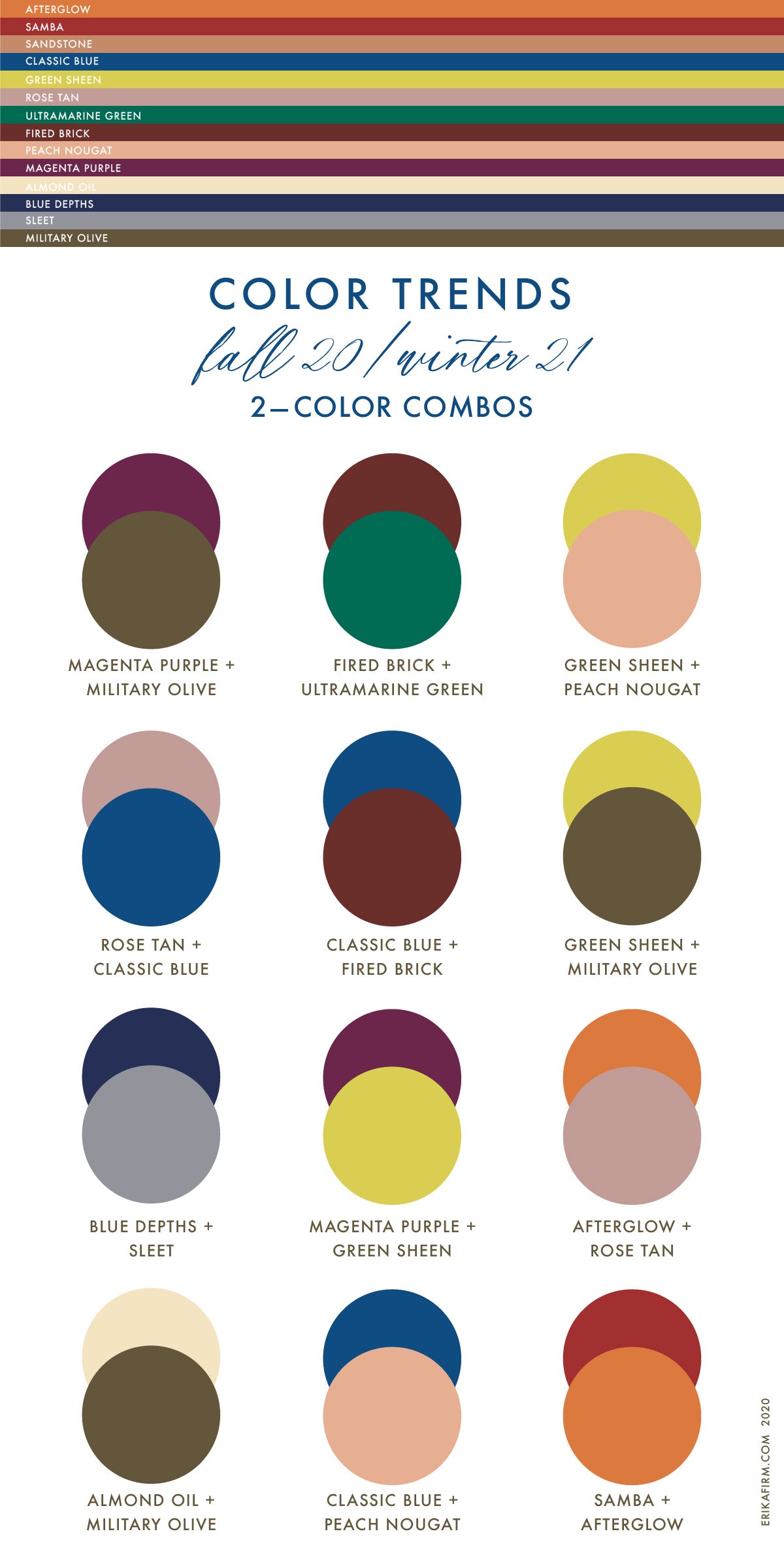
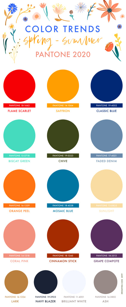
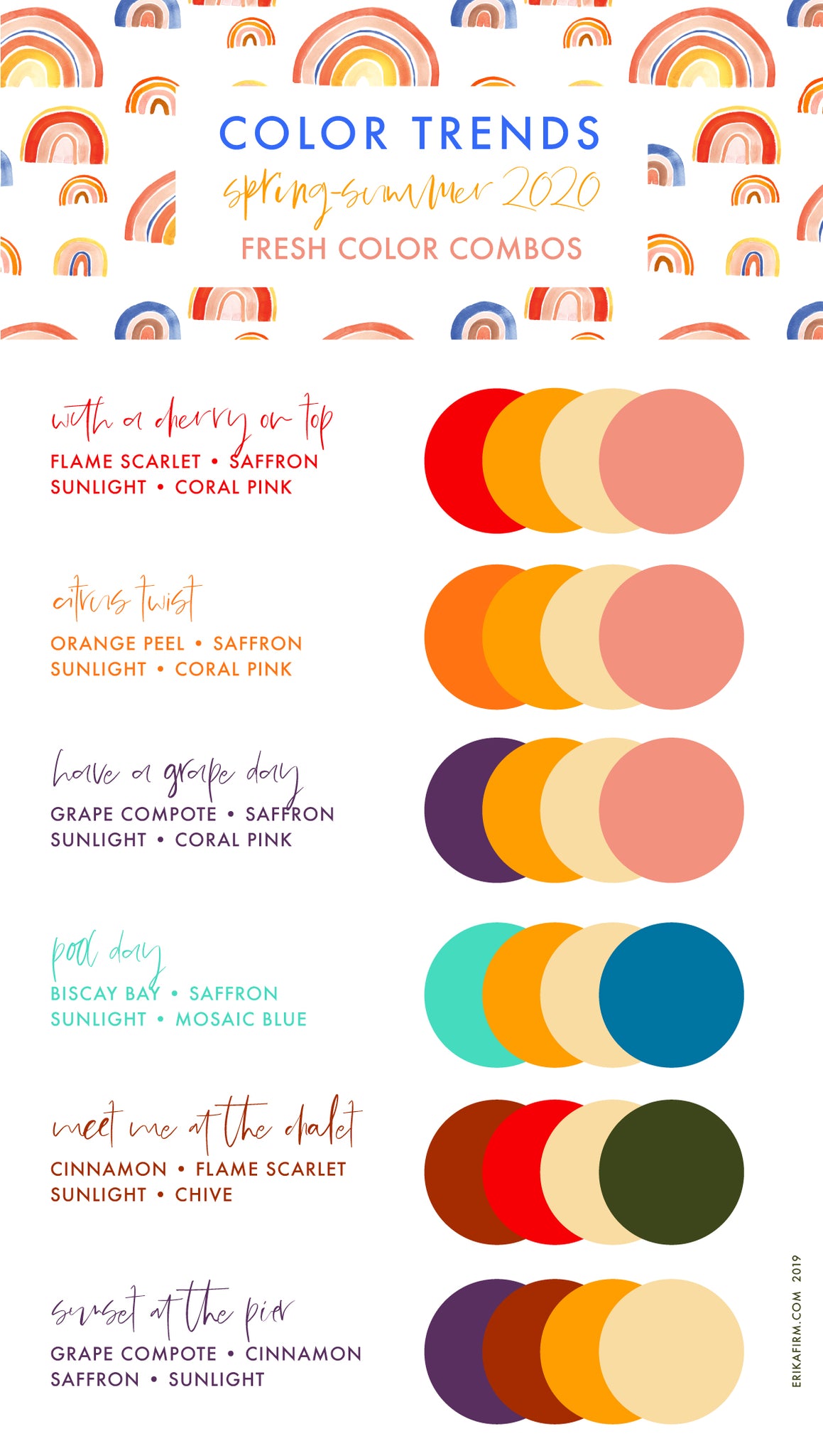
Some of my color combos use sunlight, saffron, and coral pink paired with a bold accent color (red? who am I?).

Color Trends Spring 2020 Summer 2020

My take on holiday color combinations ... because I ALWAYS have Christmas on my mind. I think if you paired any of the above color combos with something a little sparkly they are super festive.


Continue reading

Ultra Violet is Pantone's Color of the Year for 2018

Ultra Violet is Pantone's Color of the Year for 2018
Ultra Violet is Pantone's Color of the Year 2018. Color combination ideas using Ultra Violet by Erika Firm.Y'all. #Designerproblems. Big time. Pantone might legitimately be trying to kill me with their 2018 Color of the Year pick: Ultra Violet. I had a feeling it might be a purple (see my previous post), but I was hoping for Pink Lavender or Almost Mauve if they went with a dreaded violet hue. But I do have a year to try to get used to it. I've compiled some color combinations using Ultra Violet that don't make my eyes bleed, using Pantone's Spring Trend colors for 2018. Hopefully you'll spot some color combos using Ultra Violet that you can use for inspiration. What do you think of the 2018 Pantone Color of the Year? Continue reading

Van Rozeboom Interiors Branding

Van Rozeboom Interiors Branding
Shelly Van Rozeboom Interiors Branding and logo design by Erika Firm for Pismo Beach California Interior Designer Van Rozeboom Interior Designer Business Cards modern boho Central Coast of California by Erika Firm Letterpress Notecard with Envelope Liner for Shelly Van Rozeboom by Erika Firm Letterpress Stationery for Van Rozeboom Interior Designer by Erika FirmCongrats to Shelly Van Rozeboom on her new brand! Van Rozeboom Interiors is an interior design studio in Pismo Beach, California. We went with a natural, warm look, with a casual yet luxe vibe. I loved working with Shelly to come up with this stunning brand. Shelly went all out with the business cards: they are letterpressed (blue letterpress on pale shelly pink stock), foil printed (white foil on blue stock), and duplexed using the two different gorgeous papers. It's not easy to capture in photos, but the "Shelly Pink" color is actually very nearly white -- a super pale, shell pink color. Paired with a dusty yet rich Persian Blue, the pink and blue color combo is warm, inviting, and timeless. Check out Shelly's instagram feed @shellyvanr for peeks at her work and life on the Central Coast. And shhhhh ... a super fun project is in the works and you can probably spy some sneak peeks in her Instagram Stories! I'm looking to working with her on the next phase. Stay tuned for updates. Continue reading

KAVA Coffee Co. Branding

KAVA Coffee Co. Branding
KAVA COFFEE Branding by Erika Firm for Analog Creative Co. Johns Island SC Charleston SC Celebrate the YAY! Congrats to Jana and Petra of KÁVA on their new brand. KÁVA is a chic little coffee shop on Johns Island, SC near Kiawah and Seabrook. I had a great time working with them to come up with the concept and the look & feel of the place. We went with a modern, clean, fresh look, with a tropical, vacay vibe. Check out their instagram feed @kavacoffeechs for peeks at their super yummy treats. I'm partial to their almond milk cortados and home made quiche. Continue reading

Dribbble

Dribbble
Erika Firm on Dribbble Check out my work in progress, logos, ideas, rejected marks, completed logos (often before they go live!), and fun peeks into my design process on Dribbble. Continue reading