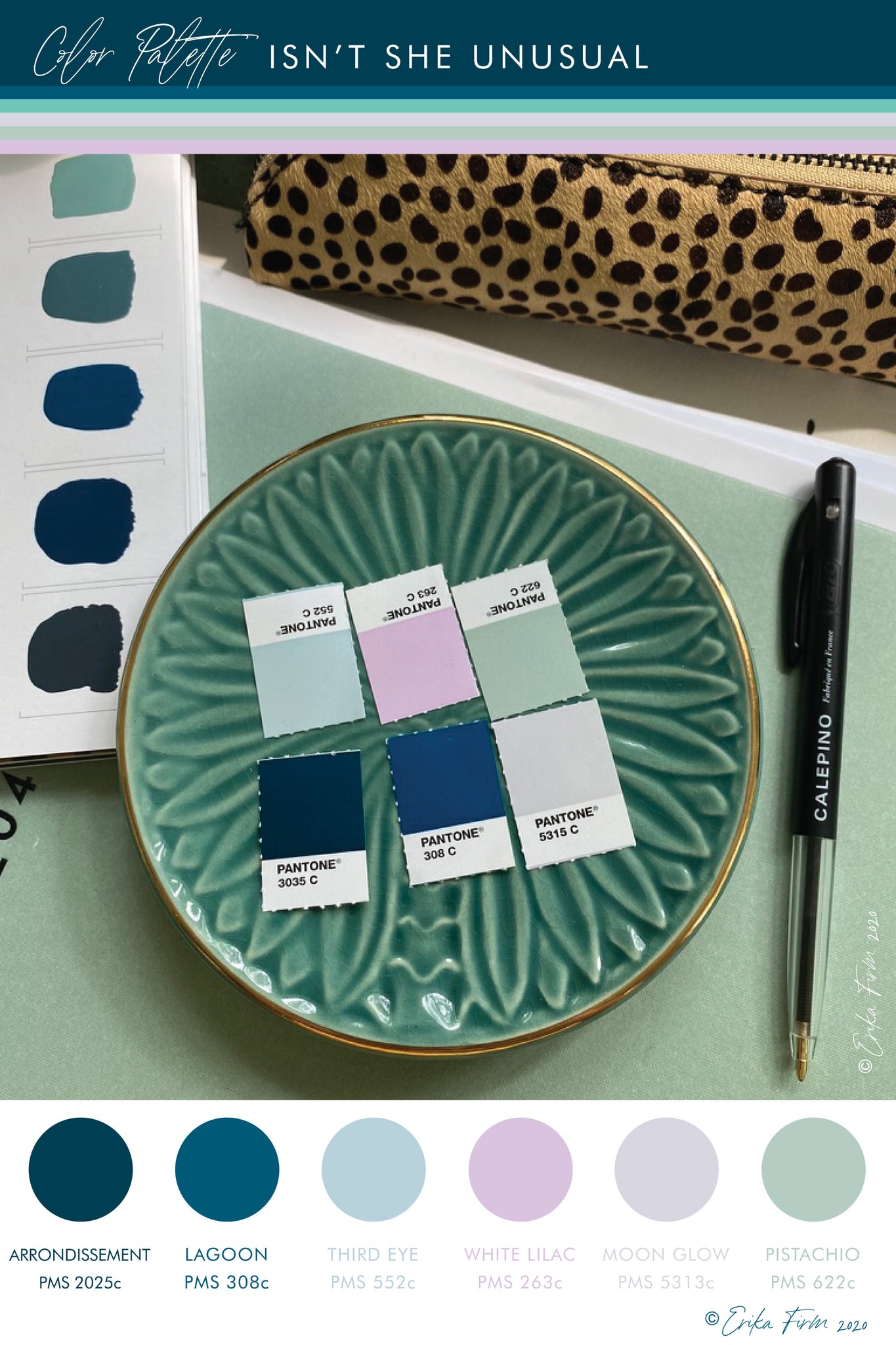
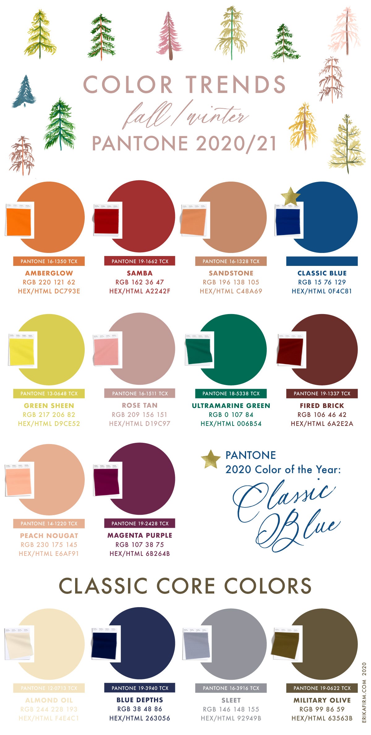
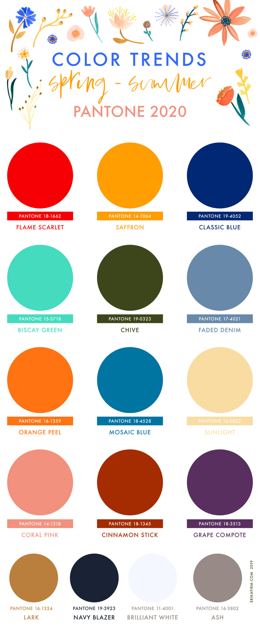
Spring Summer 2025 Color Trends
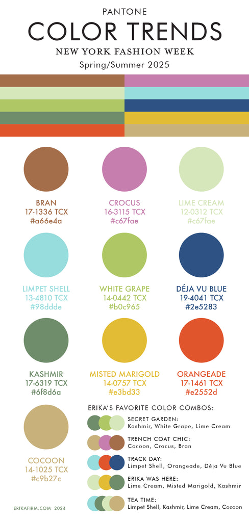
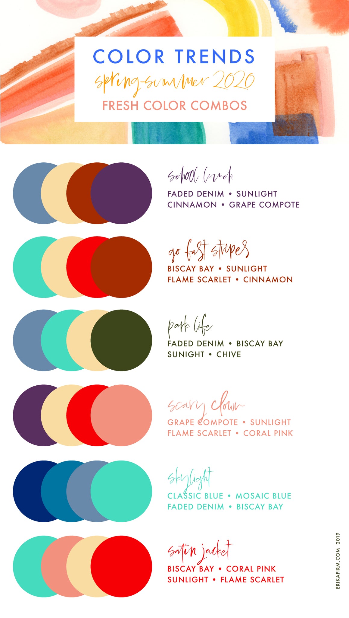
Pantone Spring/Summer 2025 Color Trends from New York Fashion Week. I'm feeling a little bit of déja vu here. It's giving early 2000s, am I right? Remember when everything was brown and green? I'm not mad at it! I pulled out some of my favorite color combos. I'm particularly feeling the creamy futuristic pastels paired with browns/neutrals ... it's giving a pop of color under a trench coat.


Continue reading


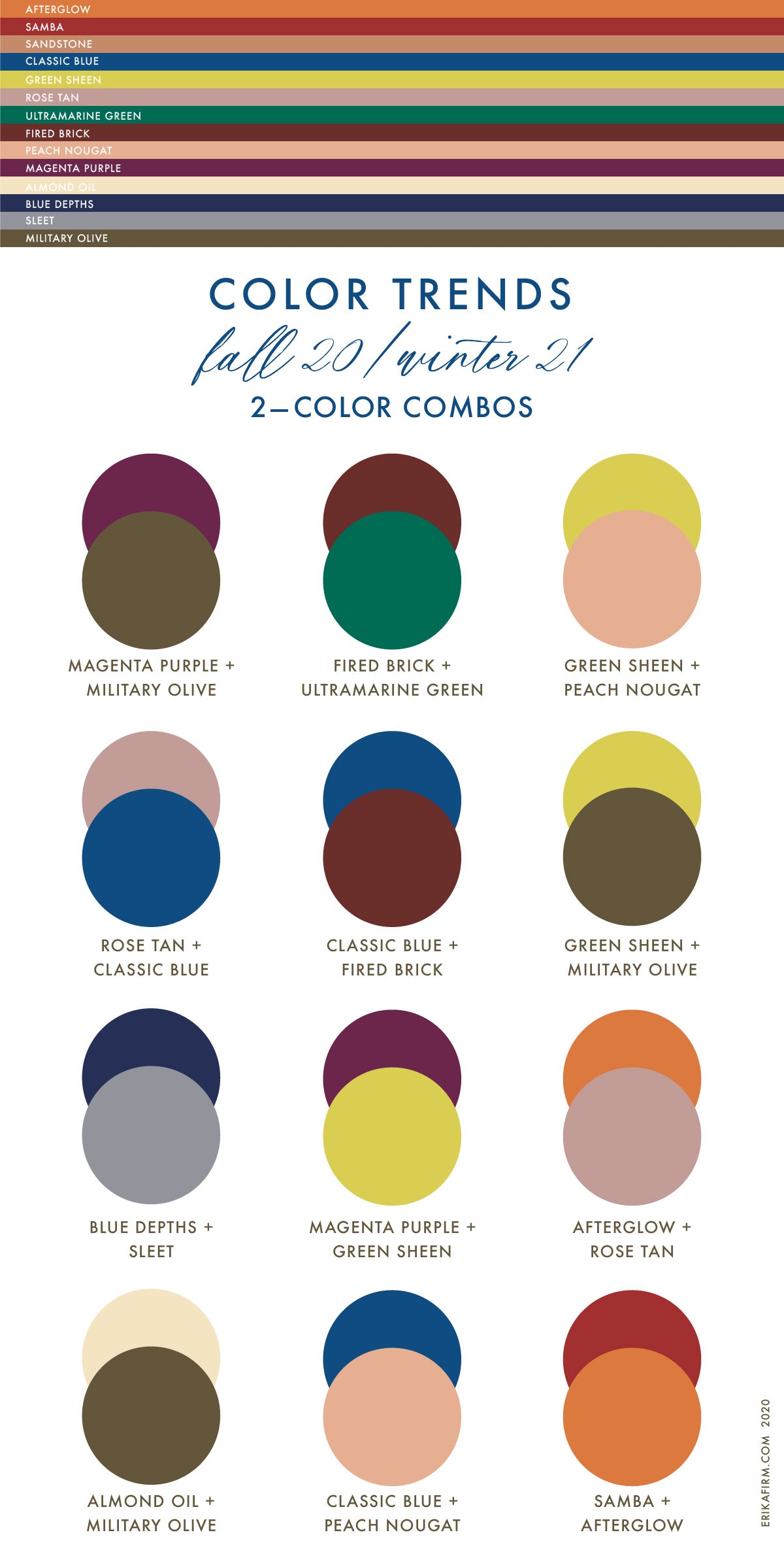
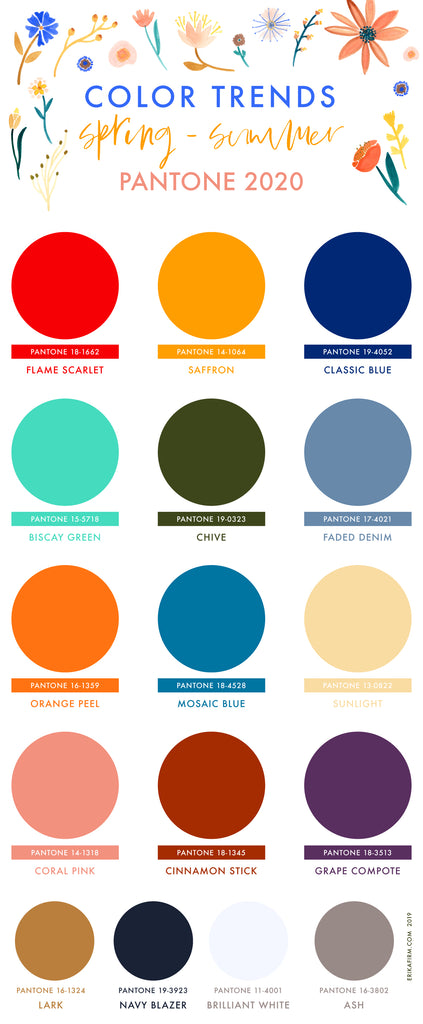

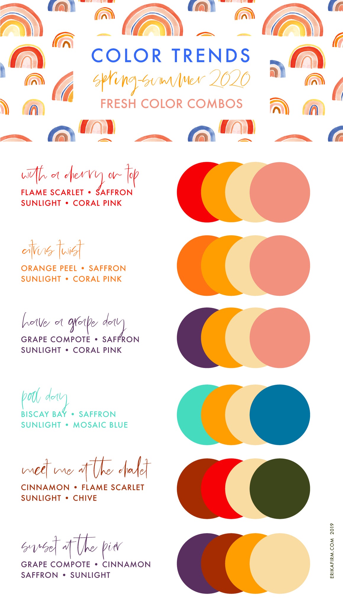 Some of my color combos use sunlight, saffron, and coral pink paired with a bold accent color (red? who am I?).