MOOD: Celiosa Smoothie
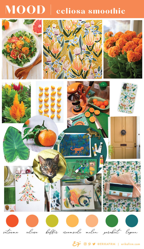


 The colors from the "Sirocco" mood board are warm and intense, yet calming. I've been seeing these colors pop up a lot in fashion, and think they work for all seasons.
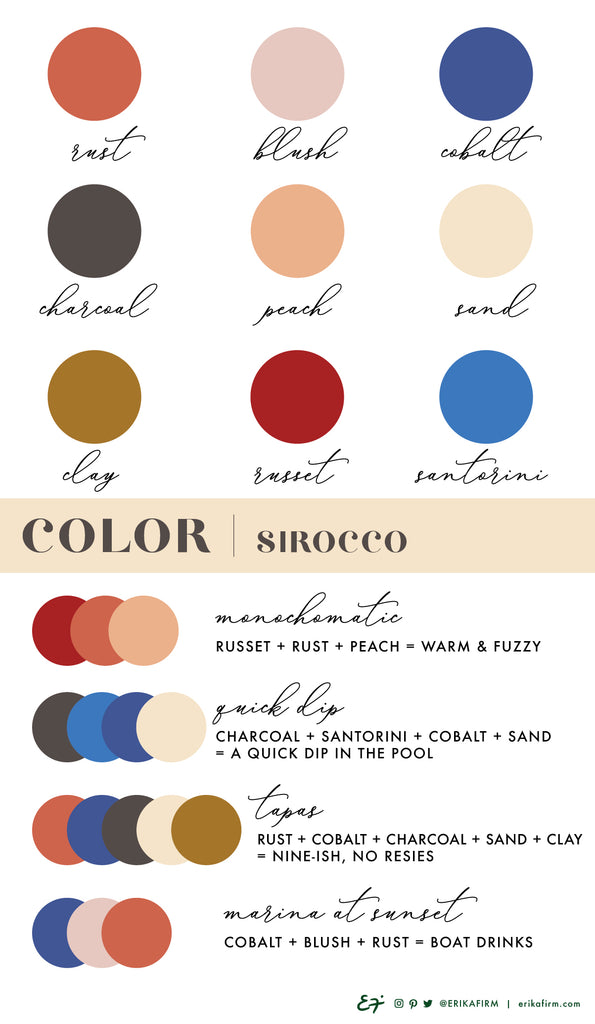
You know I love a monochromatic color palette, right? Even when it has slight hints of red, like russet + rust + peach.
"Quick Dip," with its vibrant blues and warm sand colors, has me dreaming of lounging by a pool, preferably an exotic resort pool. I can smell the sweet scent of chlorine and sunscreen now!
"Tapas" is all about casual summer nights: drinks and snacks with old friends. I love cobalt blue, rust, charcoal, sand, and clay together. I can envision an entire restaurant built out in these colors. Dramatic, yet comforting. These are gorgeous colors for a date night outfit.
"Marina at Sunset" is the color palette that works best for Spring, I think. I can see a fun sundress in these colors. It has me thinking of brunch with friends in a marina overlooking La Jolla Cove. And boat drinks. Always, boat drinks.
Continue reading
The colors from the "Sirocco" mood board are warm and intense, yet calming. I've been seeing these colors pop up a lot in fashion, and think they work for all seasons.
You know I love a monochromatic color palette, right? Even when it has slight hints of red, like russet + rust + peach.
"Quick Dip," with its vibrant blues and warm sand colors, has me dreaming of lounging by a pool, preferably an exotic resort pool. I can smell the sweet scent of chlorine and sunscreen now!
"Tapas" is all about casual summer nights: drinks and snacks with old friends. I love cobalt blue, rust, charcoal, sand, and clay together. I can envision an entire restaurant built out in these colors. Dramatic, yet comforting. These are gorgeous colors for a date night outfit.
"Marina at Sunset" is the color palette that works best for Spring, I think. I can see a fun sundress in these colors. It has me thinking of brunch with friends in a marina overlooking La Jolla Cove. And boat drinks. Always, boat drinks.
Continue reading
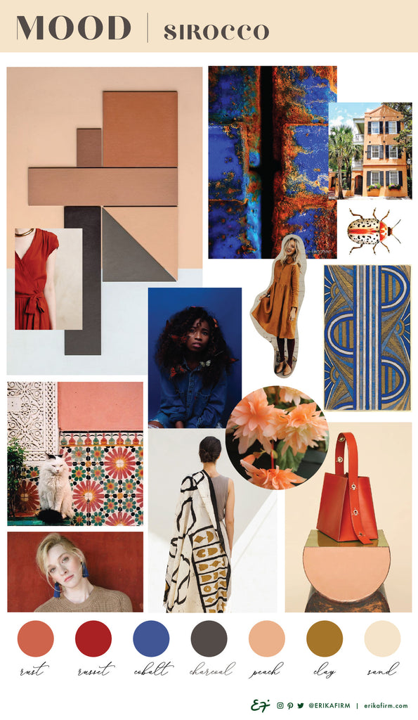
 I've been dreaming of an exotic summer vacay ... one with lots of poolside lounging, fancy boat drinks, and gorgeous sunsets. Who's with me?!?
This Sirocco mood board's vibe is dramatic, exotic, warm, and comforting. Key colors are Rust, Russet, Cobalt Blue, Charcoal, Peach, Clay, and Sand.
Continue reading
I've been dreaming of an exotic summer vacay ... one with lots of poolside lounging, fancy boat drinks, and gorgeous sunsets. Who's with me?!?
This Sirocco mood board's vibe is dramatic, exotic, warm, and comforting. Key colors are Rust, Russet, Cobalt Blue, Charcoal, Peach, Clay, and Sand.
Continue reading
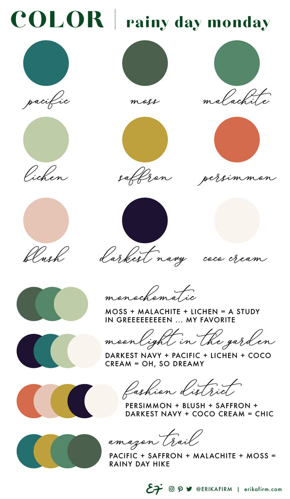 The colors from the "Rainy Day Monday" mood board are pulled from nature. I noticed each of these colors popping up in the Live Oak tree canopy at the entrance of Johns Island the other day, especially the "Amazon Trail" color palette, with its pop of saffron yellow and deep Pacific teal.
Because they're pulled from nature, all the Rainy Day Monday colors are fairly muted and neutral, which makes them all mix and match beautifully. Really, you could take any two or three of these colors and they'll make a lovely color palette.
Some of my favorite color combinations are monochromatic (alllll the greens, please: moss, malachite, lichen), and the romantic Moonlight in the Garden color palette. Darkest Navy reminds me of summer night strolls, Pacific & Lichen greens remind me of garden foliage, and coco cream reminds me of sweet jasmine flowers ... all key elements to a romantic Moonlight in the Garden rendezvous.
Lately I've been loving the "Fashion District" color combo: persimmon, blush, saffron, darkest navy, and coco cream. So chic! I predict that my linen persimmon orange shirt/saffron yellow linen pants outfit is going into heavy rotation this year.
Continue reading
The colors from the "Rainy Day Monday" mood board are pulled from nature. I noticed each of these colors popping up in the Live Oak tree canopy at the entrance of Johns Island the other day, especially the "Amazon Trail" color palette, with its pop of saffron yellow and deep Pacific teal.
Because they're pulled from nature, all the Rainy Day Monday colors are fairly muted and neutral, which makes them all mix and match beautifully. Really, you could take any two or three of these colors and they'll make a lovely color palette.
Some of my favorite color combinations are monochromatic (alllll the greens, please: moss, malachite, lichen), and the romantic Moonlight in the Garden color palette. Darkest Navy reminds me of summer night strolls, Pacific & Lichen greens remind me of garden foliage, and coco cream reminds me of sweet jasmine flowers ... all key elements to a romantic Moonlight in the Garden rendezvous.
Lately I've been loving the "Fashion District" color combo: persimmon, blush, saffron, darkest navy, and coco cream. So chic! I predict that my linen persimmon orange shirt/saffron yellow linen pants outfit is going into heavy rotation this year.
Continue reading
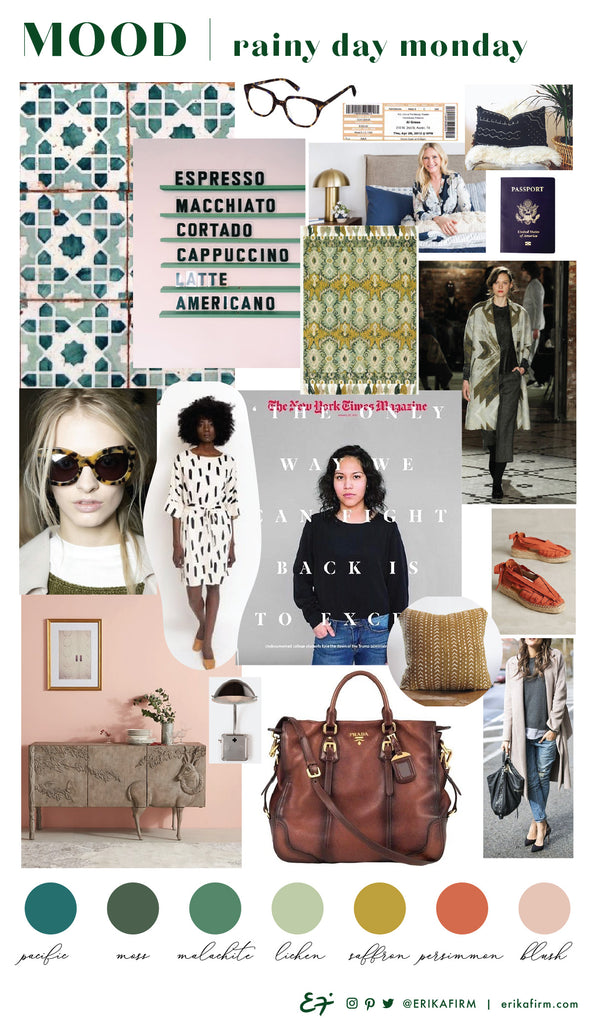 The recent rainstorms here in Charleston have put me in a Rainy Day Monday mood. This vibe is somber, slightly brooding, and muted ... with lots of green (of course). Key colors are Pacific Teal, Moss Green, Malachite, Lichen, Saffron, Persimmon, and Blush.
Continue reading
The recent rainstorms here in Charleston have put me in a Rainy Day Monday mood. This vibe is somber, slightly brooding, and muted ... with lots of green (of course). Key colors are Pacific Teal, Moss Green, Malachite, Lichen, Saffron, Persimmon, and Blush.
Continue reading
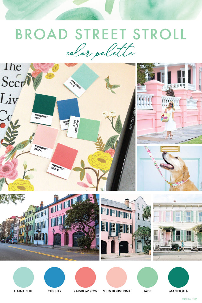
 The colors of downtown Charleston are endlessly inspiring. This color palette is inspired by a stroll along Broad Street.
Continue reading
The colors of downtown Charleston are endlessly inspiring. This color palette is inspired by a stroll along Broad Street.
Continue reading
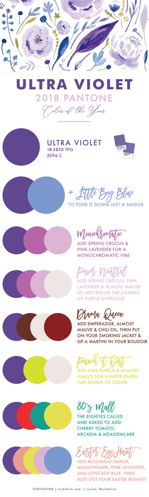
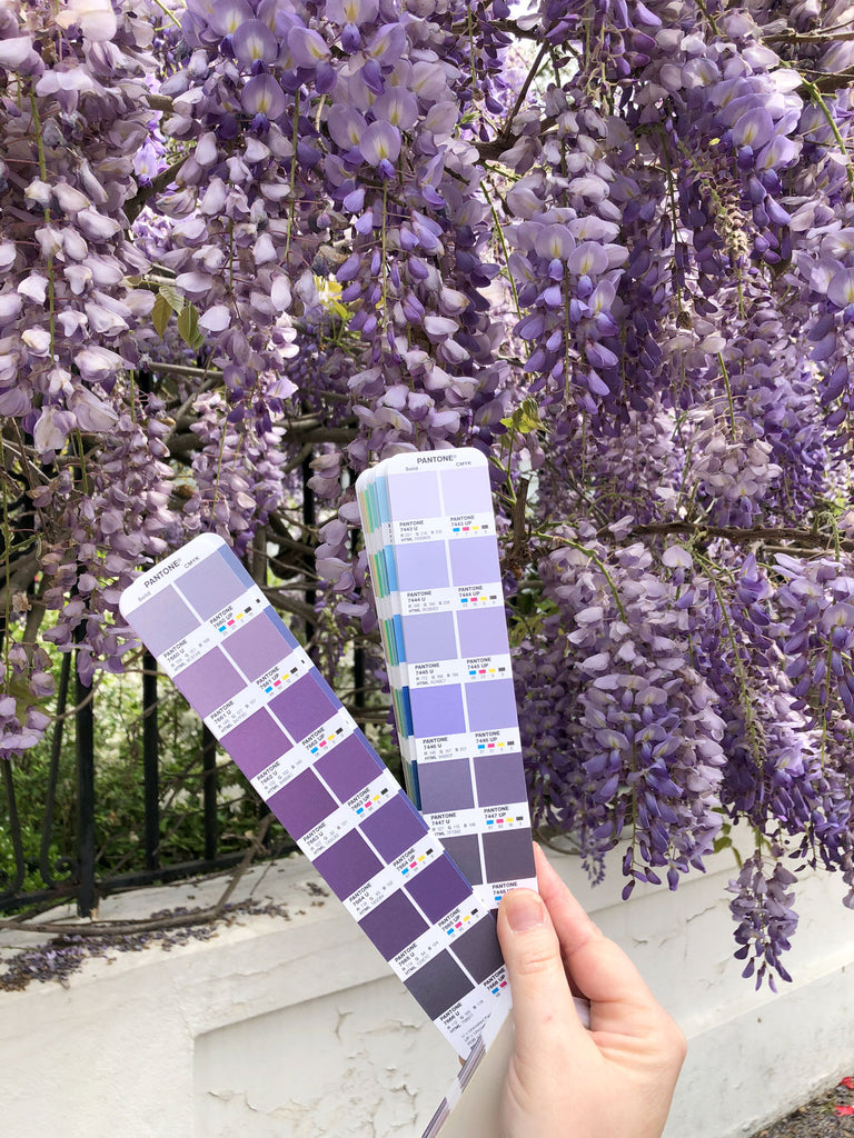
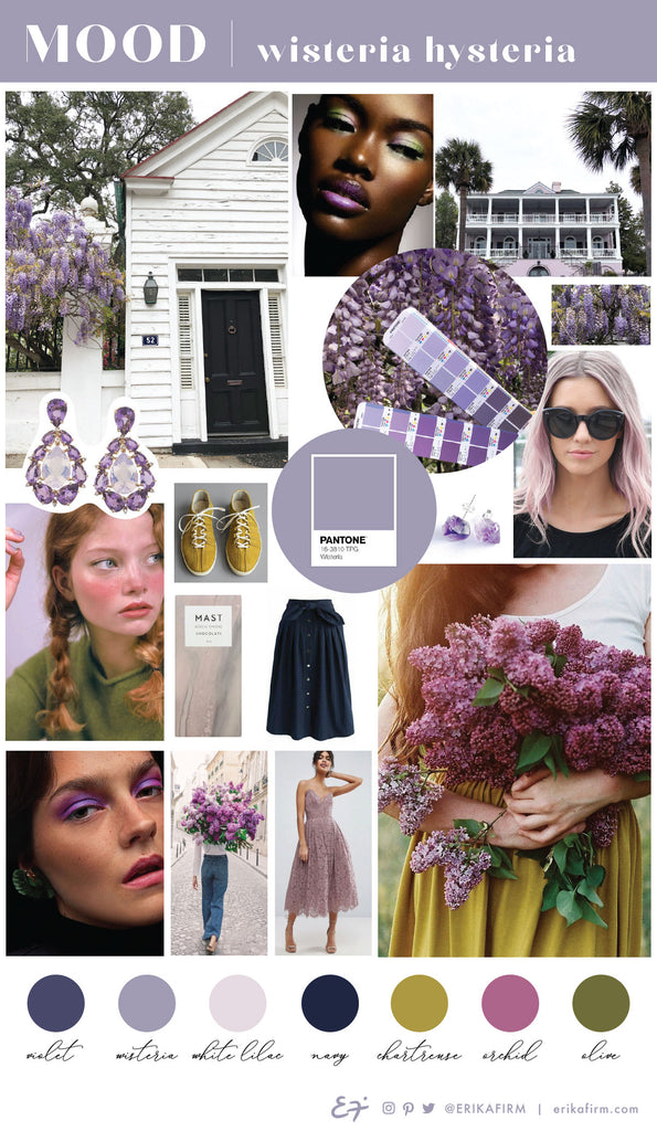
 Y'all. #Designerproblems. Big time. Pantone might legitimately be trying to kill me with their 2018 Color of the Year pick: Ultra Violet.
I had a feeling it might be a purple (see my previous post), but I was hoping for Pink Lavender or Almost Mauve if they went with a dreaded violet hue. But I do have a year to try to get used to it.
I've compiled some color combinations using Ultra Violet that don't make my eyes bleed, using Pantone's Spring Trend colors for 2018. Hopefully you'll spot some color combos using Ultra Violet that you can use for inspiration.
What do you think of the 2018 Pantone Color of the Year?
Continue reading
Y'all. #Designerproblems. Big time. Pantone might legitimately be trying to kill me with their 2018 Color of the Year pick: Ultra Violet.
I had a feeling it might be a purple (see my previous post), but I was hoping for Pink Lavender or Almost Mauve if they went with a dreaded violet hue. But I do have a year to try to get used to it.
I've compiled some color combinations using Ultra Violet that don't make my eyes bleed, using Pantone's Spring Trend colors for 2018. Hopefully you'll spot some color combos using Ultra Violet that you can use for inspiration.
What do you think of the 2018 Pantone Color of the Year?
Continue reading